Part 3 of my Data Science x AO3 series!
From one-shots to heartwrenching, multi-book epics, there’s a whole range to lengths and word counts of fanfiction. Personally, I’m a huge fan of fix-its where an author explores a hypothetical, even better if it’s just one change in canon: a character making a different choice, an accident or stroke of luck that causes the cards to fall a different way. Two examples/recommendations:
- Year of the Ghost by scrappybook for Naruto: Hatake Kakashi retires from being a shinobi and becomes a farmer instead after the first Kyuubi attack. It’s about a traumatized assassin/war veteran learning how to be a functional, empathetic human being again, finding community and beauty in the small things, and the understanding that healing is always a nonlinear process
- A Wolf Amongst Lions by Kallypso for Game of Thrones: In canon, Tywin Lannister never finds out that his cupbearer at Harrenhal is actually Arya Stark. In this fic, he does, and he exploits it, and out comes this strange, convoluted supplanted father-daughter dynamic where they try to outwit each other the entire way. Made me cry at the end!
Recommendations aside, I realized that in the AO3 dataset, higher counts of fics don’t always translate to longer fics. This piece is a quick investigation into what that might look like when visualized as a scatter plot! Play with it here.
Setting up
The main challenge with this question was merging the “works” and “fandoms” datasets from AO3. Both are huge! And merging them raw would cause my kernel to time out every time I tried, so I had to narrow the datasets:
- Filtered out the columns that I didn’t need from both datasets
- Dropped all the NaNs
- Filtered out tags in “works” that weren’t fandoms
- Filtered out fandoms that were redacted
This gave me:
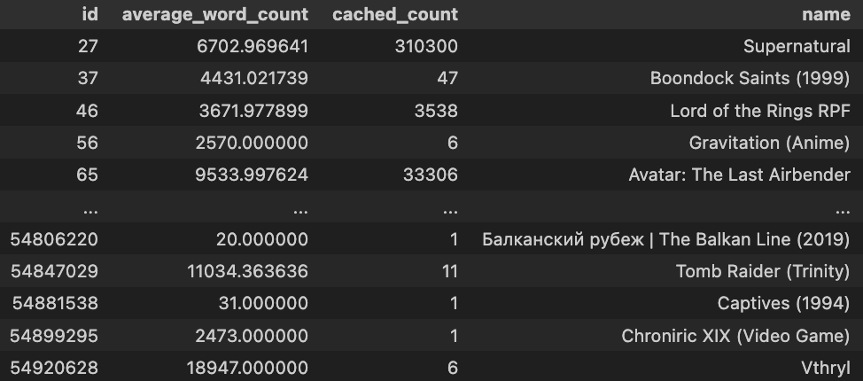
Graph!
So this full dataset with fandom names, average word counts, and count of fics had 45716 rows. Which is huge! Definitely too many to plot. Instead, the following graphs all sample 100 fandoms from the pool to plot. If you run it over and over, the fandoms sampled will change — you can try that in this interactive deepnote.
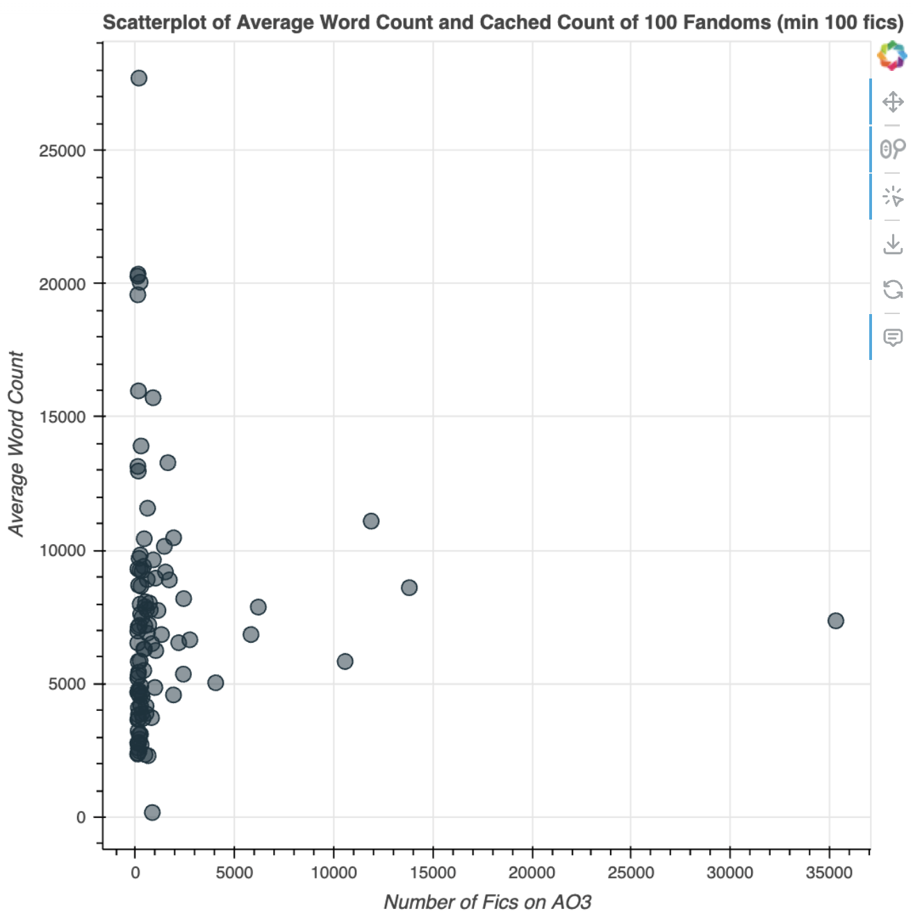
Here’s the first scatterplot of average word count against number of fics I generated (random_seed=42):
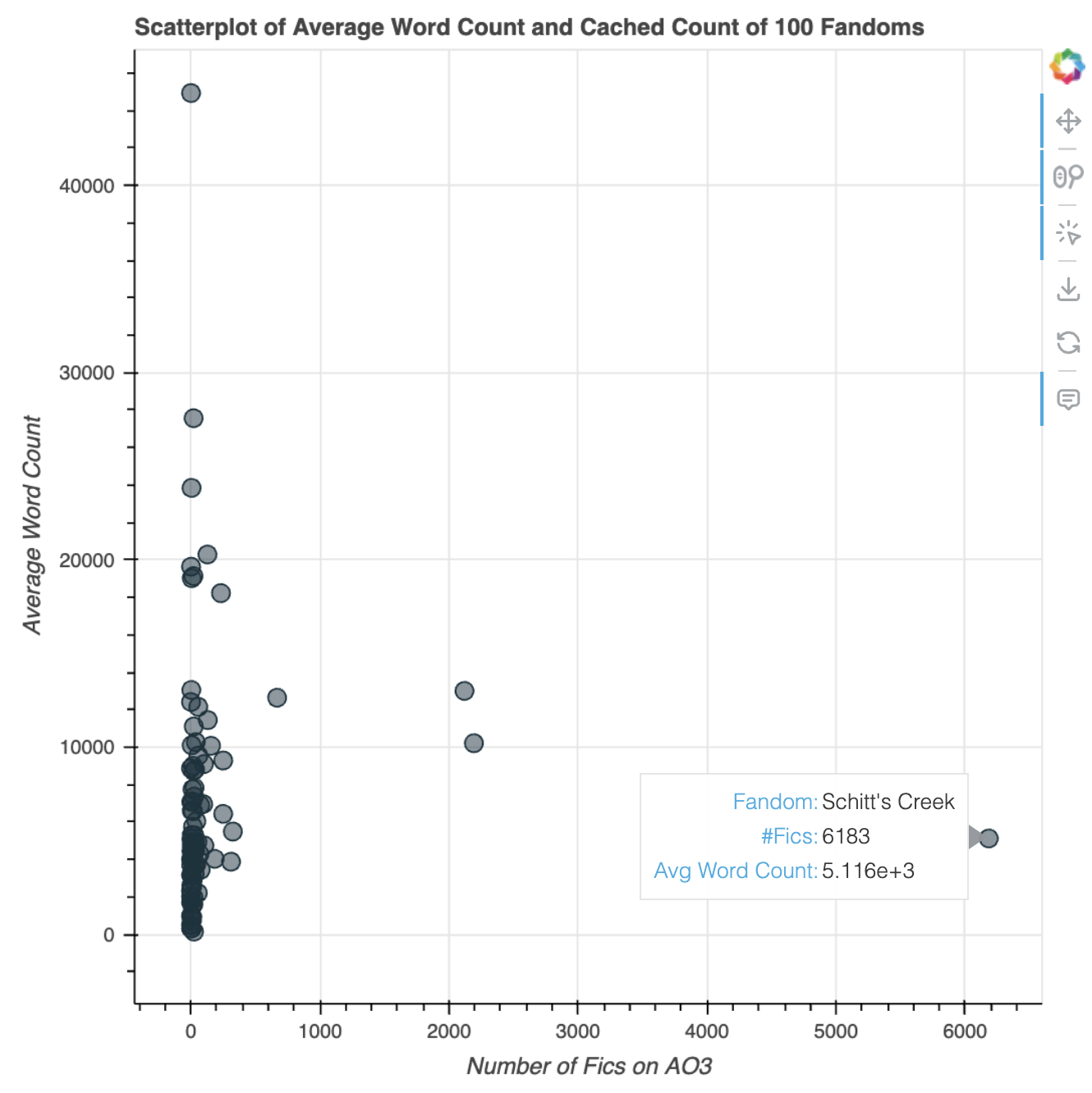
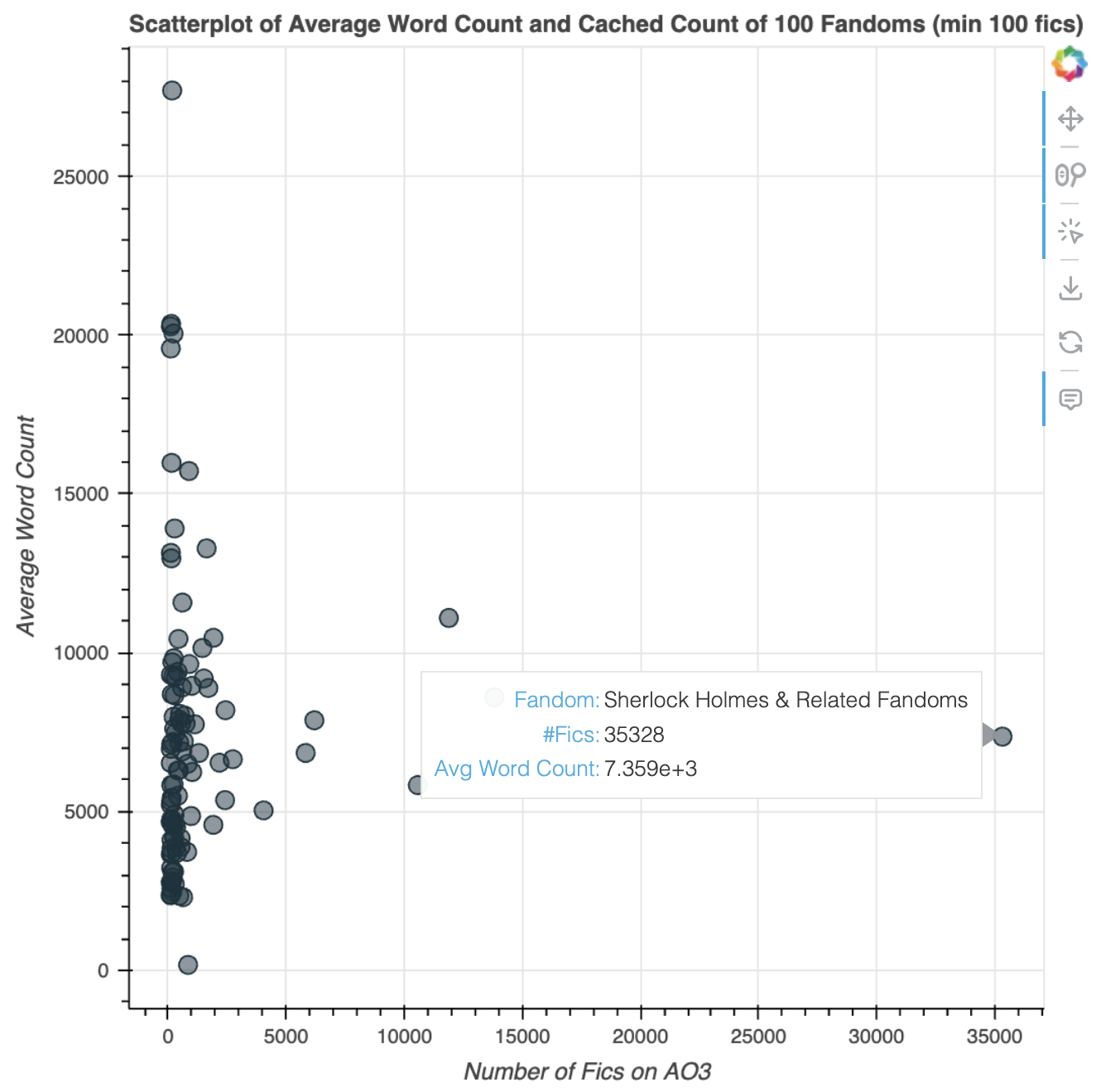
You can tell that it’s really concentrated on the y-axis. There are lots of fandoms with pretty low numbers of fics, so they’re all clustered there. I decided to limit to representing only fandoms with more than 100 works:
Observations
Interestingly, K-pop is represented here as a fandom, with the second most number of fics in the sample — second to “Sherlock Homes & Related Fandoms”, which is probably a catch-all for the many variations of the Sherlock Holmes stories out there.
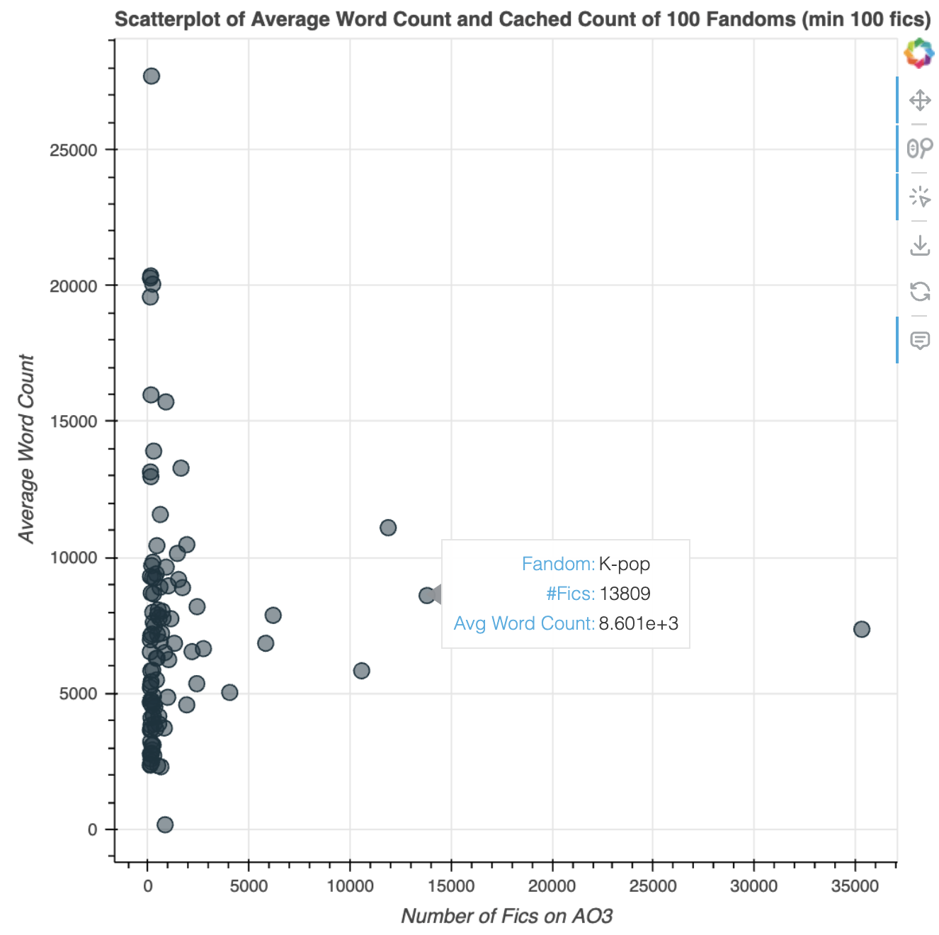
The top-most point, with 169 fics and 27.7k in average word count, is the “Spectacular Spider-Man (Cartoon)” fandom!
Thoughts
Don’t have too many observations for this one beyond it being really fun to keep sampling from the fandom dataset and finding new fandoms! This time it was definitely a harder implementation in terms of brainstorming ways to narrow the datasets so my machine could actually make things happen.
Currently playing with an idea of making a social network but for fandoms instead of characters, to see what links with what in terms of cross-overs!
Public interactive Deepnote for this article