Part 2 of my Data Science x AO3 series!
I’ve been obsessed with using a package called NetworkX to create visualizations of social networks ever since taking a demography class at Cal that used it to model the friendships, communities, and even the spread of disease. I tried my hand at it when I was part of Data Science Society at Cal, and made this pretty cool social network graph of the club’s members and their friendships. You can find it here, and it contains a mock pandemic simulation too. A major learning point from that experience was learning how to turn the NetworkX graph into an interactive bokeh visualization that you can zoom in and out on, hover over for node labels, etc.
AO3 Character Visualization
I did the same thing with this AO3 dataset!
The interactive deepnote can be found here. Scroll all the way down, and zoom in/out, mouse over the nodes, and explore! Super fun stuff, and all my code is included too! (Barring some edits I had to make to reduce CPU usage)
Process
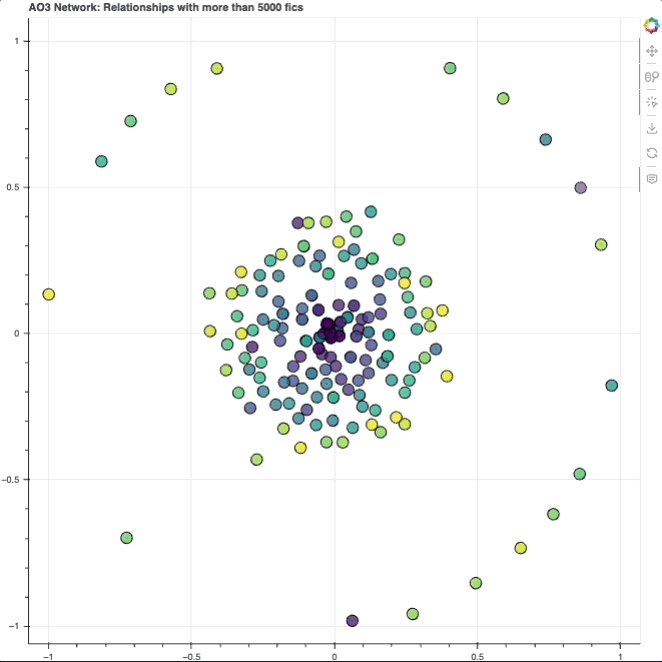
Nodes
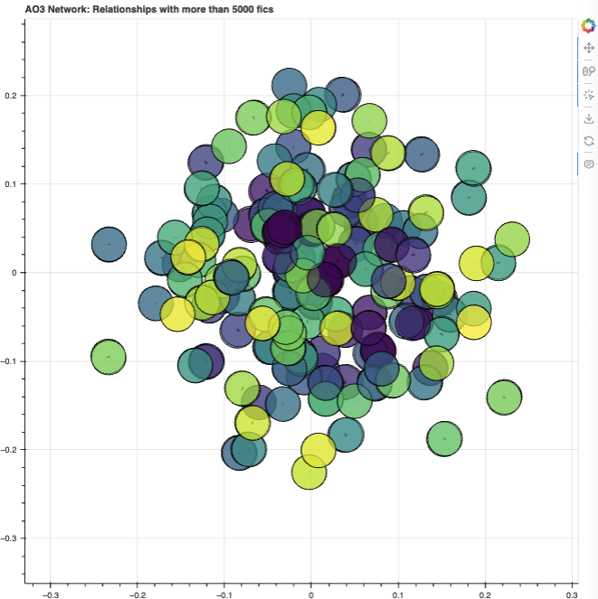
Each node (circle) represents a character. As you can see, they’re kind of laid out in a circle format, with a dense cluster in the center and a bunch surrounding it. We’ll get to why exactly it looks like that later.
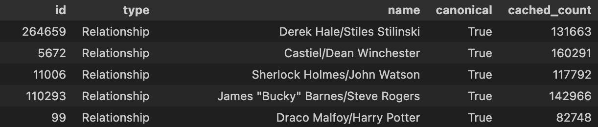
In the original dataset, relationships were listed as tags. After filtering only for relationships and sorting by total count of tags, I get this list of the top 5 tagged relationships in the dataset:
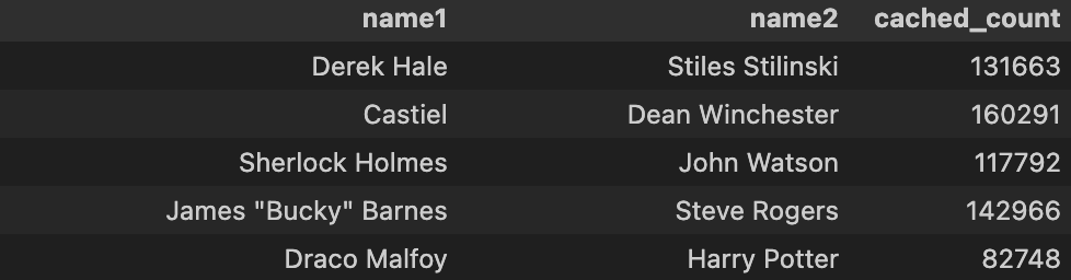
My gameplan for making this social network was that it had to be a social network, so each node had to be an individual character, and so I had to split up the above table into an edgelist. Which looks like this:
Only then can this data be fed into NetworkX!
At this point, however, I have too many nodes and they’re cluttering up the graph to the point where I can’t distinguish between any of them. To mitigate that, I decided to filter out pairings below a minimum number of fics. I set the default number to a minimum of 5,000 fics. That meant reducing the number of pairs from 23,684 to 244 — a much more manageable number of nodes!
Colors
Still trying to make the graph less like one black blob of overlapping nodes, I decided to introduce color. The cool thing I wanted to try out is that there’s a community API that can automatically sort nodes into communities:
community.``best_partition(graph, partition=None, weight=‘weight’, resolution=1.0, randomize=None, random_state=None) Compute the partition of the graph nodes which maximises the modularity (or try..) using the Louvain heuristices
It’s definitely a less interpretable way to handle communities, but I wanted to try it out!
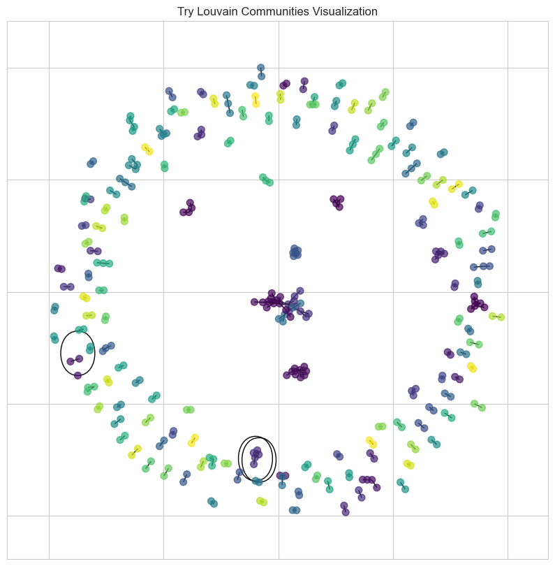
Now we can see little clumps and groups starting to form! Super cool.
Interactivity
That’s all super difficult to interpret, however, because we can’t look into the network to see which node is which character. This is where bokeh comes in: it allowed me to make an interactive graph that you can zoom in and out of, hover over a node to learn more about what it represents, etc.
Even then, the spread of nodes was definitely an issue. I was stuck with a lot of overlapping for a while:
I found 2 solutions for this:
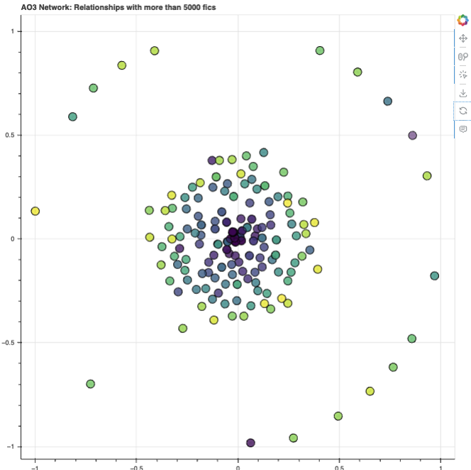
- Choosing the fruchterman_reingold_layout over the spring_layout I was using before
- Both were equally efficient
- But, apparently Fruchterman Reingold generally produces visually pleasing layouts with good separation of nodes, requiring less tailoring than the spring layout
- How it works: it’s kind of like physics. It pretends edges between nodes are springs, that attract connected vertices towards each other and has a competing repulsive force that pushes all of them away from each other. It can go back and forth iteratively, to find the most optimal positions for the nodes
- This results in that circular/ring-like layout in the first gif
- Setting k=0.7 and iterations=100
- k: sets the optimal distance between nodes. Default=None, but if set, increasing this can move nodes further apart
- iterations: default=50, but can be increased. Sets the number of iterations of spring-force relaxation
Those changes resulted in this:
pos = nx.fruchterman_reingold_layout(G, k=0.7, iterations=1000)
And thus this:
Interpretation
Double nodes I think the most obvious observation here is that you’re not seeing any edges beyond the black dots in the middle of each node. And that’s because each node you see here is actually two nodes layered on top of each other — 2 characters are close because they’re tagged as being in a relationship, and they’re unlikely to be shipped with other characters (especially if it would be across different fandoms), so the organizational layout just decides to put the two nodes directly on top of each other to signify that close relationship.
Inner cluster & outer ring I know that the outer ring layout seems to create an in-group/out-group effect where the characters on the outer ring are seemingly very separated from the cluster in the middle, but I wouldn’t say that that’s necessarily the conclusion here. I’m choosing to think of it more as two possibilities:
- The origin point (where the darkest purple clusters are) seems to be made up of mostly characters from the ships with the highest fic counts. So it’s possible that distance from the origin could be an indication of lower fic counts
- More likely though: the spread of nodes across the 2D space here is determined by proximity between characters. So these characters on the outer ring (e.g. Maze Runner’s Newt/Thomas, Rogue One’s Cassian/Jyn) are likely:
-
- Almost always shipped with the character they’re paired with
-
- Never shipped with other characters in the inner cluster
-
Proximity =/= fandom
It also bears pointing out that despite appearances, node-pairs/relationships that are in the same fandom are not always near each other. One example is a cluster of Sherlock, John, Molly and Mary’s nodes, but pretty far away from the Greg/Mycroft node pairing below.
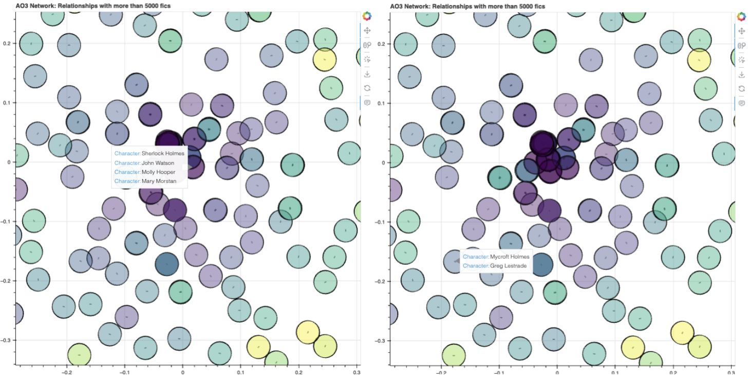 This supports my hypothesis that proximity between nodes/nodes-pairs isn’t really about how close the characters might be in terms of fandom/canon, but just whether they tend to be shipped together. I know there’s quite a lot of Sherlock x MCU crossovers, and some ships with Sherlock himself and, say, Tony Stark, so that might have drawn the 4 characters from Sherlock towards the center cluster with all the MCU characters.
Multi-character overlaps
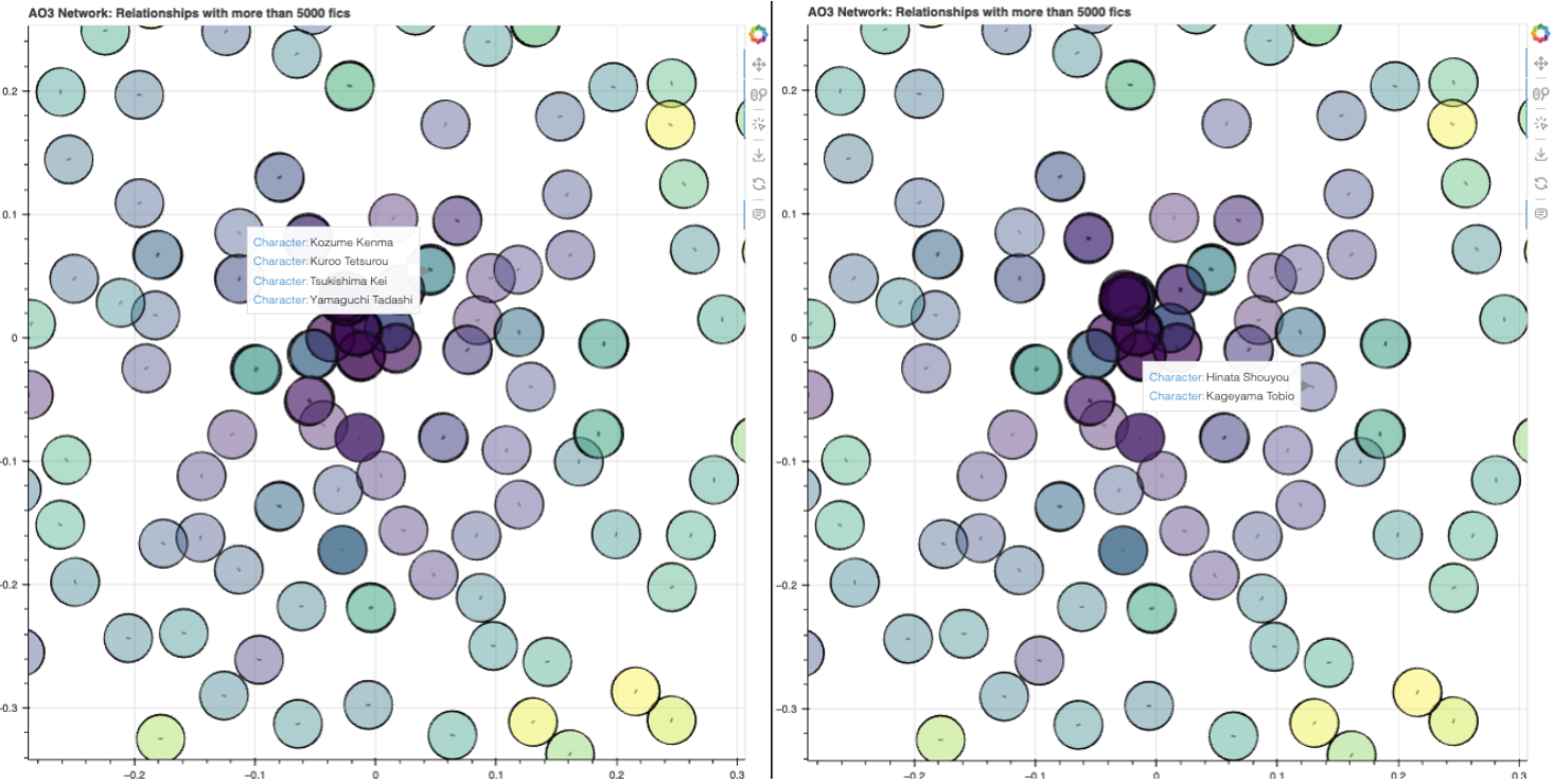
On that note, it’s super interesting to see what fandoms have multi-character overlaps, and which ones don’t. Here’s Haikyuu!, showing a clear preference for Hinata/Kageyama, but a mix of overlapping relationships between Kenma, Kuroo, Tsukishima and Yamaguchi. (It might be relevant to note that I resolved relationships with more than 2 characters involved by counting each individual 1-1 relationship)
In that center purple cluster, we have a huge overlap listed between:
- every member of BTS
- every member of One Direction
- Supernatural
- BNHA
- Sherlock
- Teen Wolf
- the main HP characters from original series
- most MCU characters from the Avengers movies… and Deadpool
It’s therefore likely that these fandoms often have interrelated ships, either with more than two characters in a ship (e.g. all of the Avengers team in one relationship) or many permutations within the same group (e.g. Tony/Steve, Steve/Bucky, Tony/Loki, etc.).
That’s interesting in comparison to, say, the Marauders fandom, which has Sirius/Remus overlapped (down and left from the main cluster), as opposed to all of the Marauders overlapped. We also have the Naruto fandom, with Naruto/Sasuke/Sakura superimposed on one another up and left from the middle cluster. The denseness of a fandom’s relationships can thus be visually represented this way!
Here’s the link to the notebook where you can find the interactive graph! Feel free to play around with it and let me know what else you observe! That’s all for now. :)
Part 1 of this series on DSxAO3: DSxAO3, 1; Spikes in Published Fics